ProjectHEAL is a non-profit that breaks down barriers to eating disorder treatment to give every person a shot at recovery- no matter their size, age, race, or sexual orientation. Their programs assist folx with eating disorders get the care they need and have been repeatedly denied. 30 million Americans suffer from an eating disorder, but only 10% can successfully receive the life-saving treatment they need. Project HEAL’s goal is to change that system and, in the meantime, to provide life-saving support to people with eating disorders who the system fails.

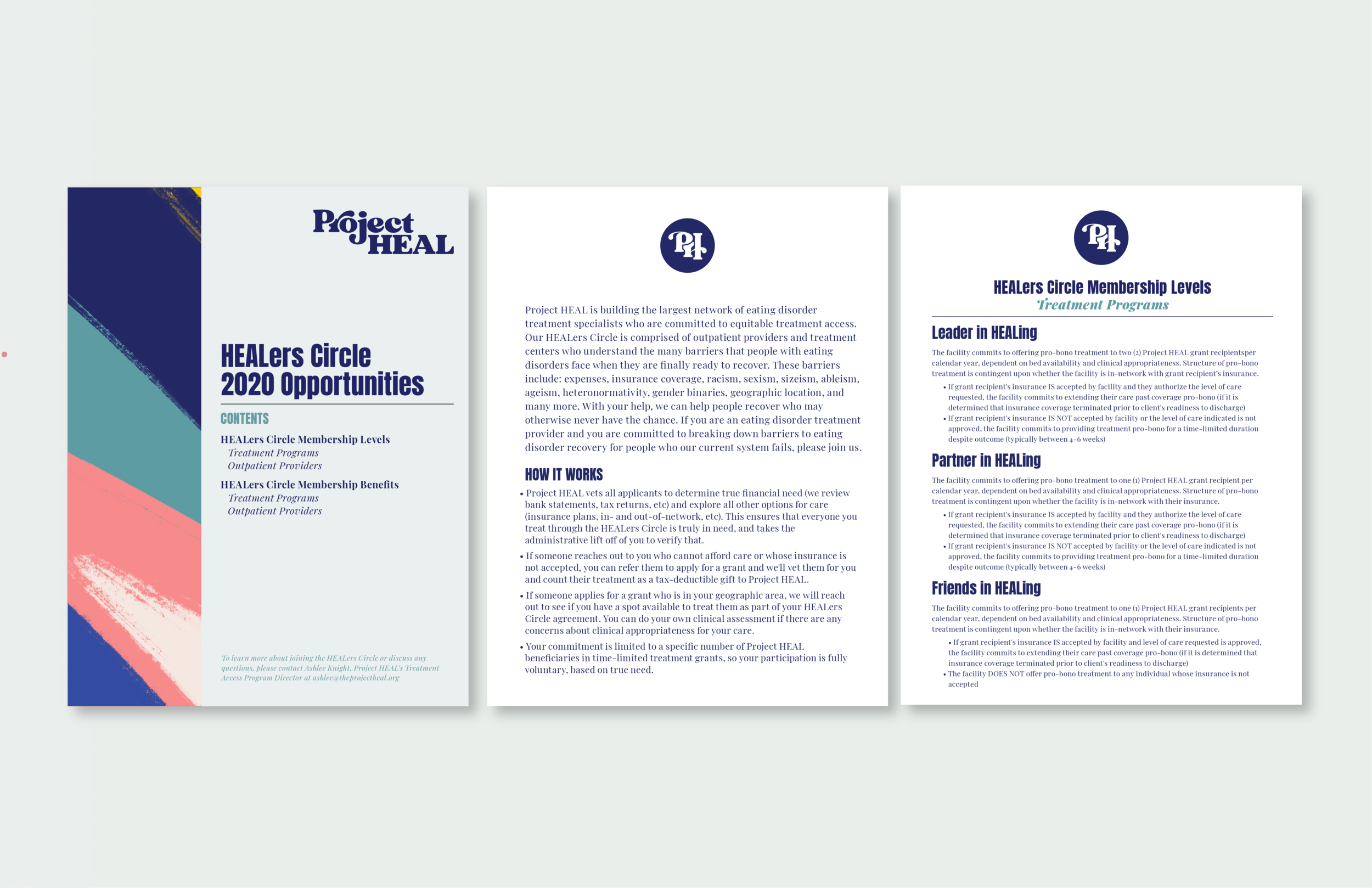
When it came to redesigning the brand for ProjectHEAL the goal was to bring a maturity that had been previously missing from the brand, but make it still seem approachable. The logo has varying line weights to show that all bodies are good bodies, all weights are good weights. The colors we chose are inclusive of all genders, bold and approachable.

Since the organization didn’t want to rely on photography on their social or web we came up with an endless assortments of graphic elements to use as background imagery across multiple platforms. By using strong brushstrokes and intense colors, we sought to convey ProjectHEALS commitment to break down barriers to eating disorder treatment..


